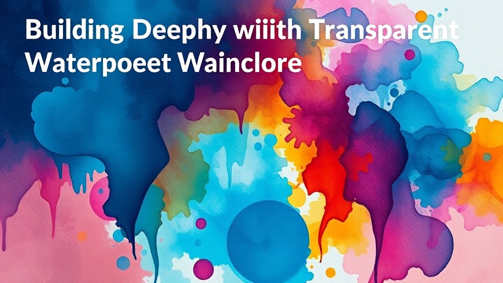
Building Depth with Transparent Watercolor Glazing

Most beginner watercolorists think that to get a deep, vibrant color, they need to use more pigment or a thicker application of paint. That's a mistake. If you try to achieve depth by simply piling on heavy layers of wet paint, you'll end up with a muddy, opaque mess that looks more like gouache than watercolor. This post explains how to master the art of glazing—the process of layering thin, transparent washes of color over dried paint—to build luminosity and complex hues without losing the transparency that makes watercolor so special.
Glazing is all about light. When you apply a transparent layer over a dry one, the light travels through the new pigment, hits the bottom layer, and bounces back to your eye. It's a physical reaction that creates a glow you just can't get by mixing colors on a palette first. It's a bit like looking through stained glass.
What is Watercolor Glazing?
Watercolor glazing is the technique of applying a thin, transparent layer of pigment over a completely dry, previous layer of paint. To do this successfully, the underlying layer must be bone-dry and the new layer must be a very light, controlled wash. If the bottom layer is even slightly damp, the new paint will lift the old pigment, creating a blotchy mess instead of a clean, translucent overlay.
Think of it like building a house. You wouldn't try to paint the second floor while the first floor is still wet cement. You need structure. In watercolor, your first layers are your foundation. If you rush the drying process, you'll lose control of the medium.
I often use a hair dryer to speed things up when I'm working on a tight deadline. It's not a "cheat"—it's a tool. Just make sure you aren't blowing hot air directly onto a wet puddle, or you'll get those dreaded hard edges. You want the paper to be uniform in its dryness.
The Tools You Need for Success
You don't need a massive kit, but you do need the right quality of materials. Using cheap, student-grade paints can make glazing difficult because they often contain more fillers and less pigment, which leads to a dull finish.
- High-quality Pigments: Look for professional-grade paints like Winsor & Newton or Daniel Smith. These brands offer much higher transparency levels.
- A Soft Brush: A synthetic or natural hair brush that holds water well is vital. You want a brush that won't "drag" the bottom layer.
- Smooth Paper: Hot-pressed paper is often better for detailed glazing because it has a smoother surface, though cold-pressed works if you're careful.
- A Clean Palette: A clean palette is non-negotiable. If your colors are contaminated, your glazes will look dirty.
If you're coming from a printmaking background, you might find the layering process familiar. If you've struggled with clarity in other mediums, you might want to check out my guide on how to build rich layers without muddy results. The logic of layering is surprisingly similar.
How Do I Prevent Colors from Mixing and Getting Muddy?
To prevent colors from mixing, you must ensure the bottom layer is 100% dry and that your new wash is extremely thin. If you use too much water or too much pigment in your second layer, the brush will physically scrub the first layer off the paper, causing the colors to blend into a single, flat tone.
The trick is the "scrub test." Before you commit to a large area, test your new wash on a scrap piece of the same paper. Apply it over a dried patch of your previous color. If the color shifts or the bottom layer lifts, your wash is too heavy or your paper is too wet.
I've found that the pigment's "granulation" also plays a role. Some pigments, like Ultramarine Blue, are more granulating than others. These can sometimes "settle" into the texture of the paper, which can either be a beautiful effect or a frustrating obstacle during glazing. It's a fine line.
Here is a quick reference for how different color combinations behave during glazing:
| Initial Layer Color | Glaze Color | Resulting Visual Effect |
|---|---|---|
| Yellow (Lemon) | Transparent Blue | A vibrant, glowing Green |
| Red (Alizarin Crimson) | Transparent Blue | A deep, moody Violet |
| Light Ochre | Transparent Blue | A sophisticated, earthy Muted Green |
| Pink (Rose) | Yellow | A warm, peachy Orange |
Note that the result is always a combination of the two, but the "glow" comes from the transparency of the top layer. If you used an opaque paint for the top layer, you'd just have a flat orange instead of a luminous peach.
How Much Pigment Should I Use in a Glaze?
A glaze should ideally consist of a very small amount of pigment suspended in a larger volume of water. The goal is a "tint" rather than a "paint." If your wash looks like a solid block of color, it's too thick—it's not a glaze anymore.
I usually start with a "tea" consistency. If I want a slightly deeper tone, I move up to a "coffee" consistency. I rarely, if at a most, go beyond a "weak coffee" strength for a true glaze. This keeps the transparency high and the risk of muddying the bottom layer low.
One thing to watch out for is the "edge." When you apply a wet wash over a dry one, the water naturally wants to travel to the edges of the wet area. This can create a dark ring (a "cauliflower" effect) if you aren't careful. To avoid this, use a thirsty brush—one that is damp but not dripping—to blot the edges of your wash as you work.
It's also worth mentioning that your choice of water matters. If you're using tap water with high mineral content, it can sometimes react with certain pigments. For the cleanest glazes, distilled water is a safe bet, though it's often overkill for most hobbyists.
If you find your colors are looking a bit flat or dull, you might need to rethink your pigment-to-water ratio. A common mistake is trying to use too much pigment to get a "strong" color. In glazing, strength comes from the number of layers, not the strength of a single wash.
A quick tip: if you're working with heavy pigments, try a "dry brush" technique for your final glaze. This involves using a very little bit of water and a lot of pigment to skim across the surface of the paper. It creates a textured, broken effect that adds incredible depth to landscapes or skin tones.
The beauty of this method is that it rewards patience. You can't rush a glaze. You can't "force" it. You have to wait for the paper to tell you it's ready for the next step. It's a meditative process, provided you don't get frustrated by the drying times.
If you're experimenting with different textures and want to see how layers interact with more tactile elements, you might enjoy my post on mixing textures with sand and gesso. While the medium is different, the principle of building up layers to create a final effect remains the same.
Keep practicing your washes. Start with simple color transitions—like a yellow to a red—before you try complex color shifts. The more you understand how light moves through your paint, the more control you'll have over your finished piece.