How to Build Rich Layers in Gel Plate Prints Without Muddy Results

Have you ever pulled a print from your gel plate only to find the colors have blended into a murky brown mess? Layering is where gel printing gets exciting—but it's also where things go sideways fast. One too many passes and your vibrant oranges and teals turn to sludge. The good news? Building complex, dimensional prints isn't about luck. It's about sequence, transparency, and knowing when to stop.
Gel plate printing (also called gelatin printing, though most plates today are synthetic) has exploded in popularity among mixed-media artists and crafters. The technique uses a squishy, receptive surface to transfer paint onto paper or fabric, creating one-of-a-kind monotypes. Unlike traditional printmaking, there's no press required—just your hands, some acrylic paint, and a bit of patience. The real magic happens when you start stacking layers: textures peek through, colors interact in unexpected ways, and each print becomes a record of your creative decisions.
What Supplies Do You Actually Need for Layered Gel Printing?
Before you start stacking colors, let's talk materials. You'll need a gel plate—Gelli Arts and Gel Press are the two main brands, and both come in various sizes. I keep a 5x7 inch plate for quick experiments and an 8x10 for more serious work. The plate itself is reusable indefinitely if you treat it right (more on that later).
For paint, stick with fluid acrylics or heavy-body acrylics thinned slightly with water. Craft paints work too, though they tend to dry faster—which can be an advantage or frustration depending on your technique. You'll want a brayer to spread paint evenly, though a foam brush or even a gift card can substitute in a pinch. Papers matter more than you'd think: smooth cardstock accepts paint crisply, while textured watercolor paper creates interesting tooth that holds pigment differently.
Here's where layering gets strategic—your tools for creating texture and pattern. Stencils, leaves, lace, bubble wrap, string, mesh bags from produce—these all create resist patterns. But for layered work specifically, you'll want masking materials: copy paper cut into shapes, freezer paper stencils, or painter's tape. These let you preserve portions of previous layers while adding new ones. A spray bottle with water is handy for reactivating dried paint, and a simple baby wipe helps clean between colors without destroying your setup.
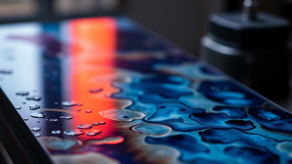
How Do You Build Layers Without Creating Mud?
The muddy print problem usually stems from one of two issues: too many opaque layers, or complementary colors mixing wet-into-wet. Here's the framework that keeps my prints clean.
Start with your lightest values. This feels counterintuitive if you're coming from watercolor, but gel printing rewards working light-to-dark. Yellows, pale blues, soft pinks—these get buried quickly if you add them later, so establish them early. Pull two or three "ghost prints" (second and third pulls from the same paint layer) to create subtle, textured foundations. These faint beginnings add depth without competing.
Let layers dry between passes. This is the rule most beginners break—impatience kills prints. Acrylic paint dries fast, but "dry to the touch" isn't dry enough for layering. Give each layer ten minutes minimum, or use a heat tool to speed things up. When you lay down a new color over truly dry paint, it sits on top rather than mixing. You get crisp edges and clean color separation.
Understand transparent versus opaque. Some acrylic colors are naturally more see-through—quinacridones, phthalos, transparent iron oxides. Others like cadmiums and titanium white are bulls hiding in china shops, covering everything beneath them. Plan your sequence: transparent layers early build luminosity, opaque layers late provide punch and definition. Golden Paints offers excellent technical documentation on which pigments fall where on this spectrum.
Use masks strategically. After your first layer dries, place a paper cutout on the plate before rolling your second color. When you pull the print, that shape will reveal the layer beneath—protected, pristine. This negative-space approach is how you achieve those striking gel prints where orange suns float against indigo skies, or white botanical silhouettes hover over layered backgrounds. The mask doesn't just preserve—it creates relationships between layers.
What Techniques Create Visual Depth in Gel Prints?
Once you've mastered clean layering, you can push into more sophisticated territory. My favorite technique is the "layered resist"—building up multiple generations of texture that seem to recede visually.
Start with a ghost print using a textured object (lace, corrugated cardboard, whatever's handy). This creates a subtle, atmospheric base. Let it dry completely. Now place a stencil on your plate, roll a semi-transparent color over it, and pull your print. The stencil pattern will appear, but the ghost-print texture from layer one will still peek through in the exposed areas. Remove the stencil, add a third color with a different texture tool, and you've got three distinct planes working together.
Another approach: the "transfer sandwich." Paint your plate, press a piece of copy paper onto it to remove excess paint (creating a "monoprint pull sheet"), then immediately press your good paper onto the remaining paint. The copy paper becomes a tool itself—those pull sheets, when collaged or used in other work, carry fascinating partial images. But the technique matters for layering because it lets you control exactly how much paint transfers, keeping subsequent layers cleaner.
Don't overlook the power of partial printing. You don't have to cover the entire plate every time. Roll paint on just the left third, pull your print, then add different paint to the right third for the next layer. This creates natural divisions in your composition—almost like panels or scenes—without any hard edges. Your eye reads these as spatial depth because we're trained to interpret overlapping as nearness.
For adding fine details without losing everything underneath, try the "stamp and lift" method. Apply paint to a texture tool (bubble wrap works beautifully), press it onto an already-dry layer on your paper, then lift immediately. You're not pulling a full print—you're adding texture to an existing surface. This is how you get those delicate speckled patterns that read as weathering, age, or organic growth.
How Do You Salvage a Print That's Gone Wrong?
Even with careful sequencing, you'll produce muddy prints. It's part of the process—and honestly, some of my favorite pieces started as disasters.
The simplest fix: collage. Cut your muddy print into strips, shapes, or organic forms, then glue them onto a fresh substrate as the starting point for something new. The visual complexity of layered gel prints means even "bad" sections contain interesting passages when isolated.
Alternatively, embrace the opacity. If your transparent layers have devolved into murk, switch to opaque colors—white, black, metallics—and use them as graphic elements that overpower the confusion beneath. A bold black silhouette or geometric stripe can turn a muddy field into intentional background texture.
You can also work back into prints with other media. Colored pencil, graphite, or acrylic markers all play nicely over dried gel prints. Those muddy areas? They're just waiting for line work to give them structure. Strathmore's mixed-media paper handles this combined approach particularly well if you want to plan for it from the start.
Finally, remember that not every print needs to stand alone. Some of my most successful layered pieces are actually two or three separate prints later combined in a collage. The white borders between them create breathing room that individual layers sometimes lack. Stack your day's output and look for relationships—chances are, two prints from the same session will harmonize in ways you didn't plan.
The gel plate rewards curiosity and punishes rigidity. Each layer is a decision, yes—but it's also a conversation with what's already there. Listen to what the previous layers are doing, respond rather than impose, and you'll find yourself creating prints with the kind of depth that keeps people looking. The muddy ones? They're just part of learning when to stop.