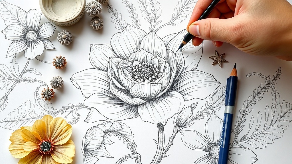
Creating Intricate Botanical Illustrations with Graphite and Eraser

A single vein traces a path through a translucent leaf, a microscopic valley between two ridges of green. A fine-tipped graphite pencil meets the tooth of heavy-weight paper, leaving behind a trail of silver-grey light. This guide explores the technical process of using graphite and erasers as additive and subtractive tools to create depth in botanical illustrations. You'll learn how to manipulate varying grades of pencil and precision erasers to mimic the organic textures of flora, from the velvety surface of a petal to the waxy sheen of a stem.
Botanical art isn't just about drawing a plant; it's about understanding its architecture. If you want to move beyond simple outlines and into the realm of realistic textures, you have to stop thinking of the eraser as a mistake-fixer. Instead, treat it as a drawing tool. It's a way to "draw" light back into a dark area.
What Are the Best Graphite Pencils for Botanical Art?
The best graphite pencils for botanical art are a range of hard and soft grades that allow for both fine detail and deep shadow. To achieve a realistic look, you can't rely on just one pencil. You need a spectrum of hardness to build up the layers of a plant's structure.
I usually start with a hard grade like a 2H or 4H for the initial, light structural lines. These are easy to erase if you mess up the proportions—and you definitely will at first. Once the skeleton of your plant is set, you move into the mid-tones with an HB or B pencil. For the darkest shadows, like the deep crevices where a leaf meets a stem, you'll want a 4B or even a 6B.
Brands like Staedtler or Faber-Castell are the industry standards for a reason. Their graphite is consistent and doesn't feel "scratchy" on the paper. If the lead is inconsistent, your shading will look blotchy, which ruins the illusion of a smooth leaf surface.
Here is a quick breakdown of how to use different grades:
| Pencil Grade | Primary Function | Visual Result |
|---|---|---|
| 2H - 4H | Initial outlines and light highlights | Very thin, light, and easy to remove |
| HB - B | Mid-tone shading and general form | Standard grey, builds the base volume |
| 2B - 6B | Deep shadows and high contrast | Rich, dark, and heavy texture |
How Do You Use an Eraser to Create Light?
You use an eraser to subtract graphite from the paper to create highlights, highlights, and texture. In botanical illustration, the "white" parts of a plant aren't just empty paper; they are light hitting a surface. By using a precision tool, you can carve light back into a shaded area.
Don't just use a big pink block eraser. That's for cleaning up a messy desk, not for fine art. For real detail, you need specialized tools. I highly recommend the Mono Zero Eraser by Tombow. It's a pen-style eraser that allows you to "draw" a thin line of white right through a dark-shaded area. It's perfect for adding the glint of light on a wet petal or the sharp edge of a leaf.
There are three main ways to use erasers in this process:
- The Subtractive Method: Shade an entire area with a medium graphite (like a B), then use a precision eraser to pull out the highlights. This creates a much more natural look than just leaving white space.
- The Texture Method: Use a kneaded eraser to dab at your shading. This lifts small amounts of graphite to create a soft, grainy texture that mimics the look of organic surfaces.
- The Detail Method: Use a precision tip to "draw" veins or the fine hairs on a stem.
It's a bit of a mental shift. You're not just erasing a mistake; you're sculpting the light. It takes practice to get the pressure right, but once you do, the depth of your work will change instantly.
What Type of Paper Works Best for Graphite?
The best paper for graphite botanical art is a medium-tooth, heavy-weight paper that can handle both the pressure of a pencil and the friction of an eraser. If the paper is too smooth, the graphite won't "grab" the surface, and your shadows will look thin and weak. If it's too rough, you'll struggle to get fine, sharp details.
I've found that a high-quality Bristol paper works beautifully for this. It has enough tooth to hold a rich graphite layer but is smooth enough for those tiny, intricate details. A weight of at least 200gsm is a good rule of thumb. You want something that won't buckle if you're working with multiple layers of shading.
When you're working with graphite, the paper's texture (the "tooth") determines how much light reflects off the surface. A smoother paper will give you a more photographic, sleek look, while a slightly textured paper will feel more organic and "hand-drawn."
If you're interested in how different textures affect the final look of a piece, you might find my post on making better linocut prints helpful. While the medium is different, the principle of understanding how your tools interact with your surface is exactly the same.
Step-by-Step: The Layering Process
Let's get into the actual workflow. I don't believe in rushing the process. If you try to go straight to the dark shadows, you'll lose the ability to add detail later.
Step 1: The Skeleton. Use a 2H pencil. Draw the basic shape of the plant. Keep your lines incredibly light. If you press too hard here, you'll leave an indentation in the paper that even the best eraser won't fix.
Step 2: Building Volume. Start with an HB pencil. Shade the areas where the light is fading. Don't try to make it dark yet—just build the foundation. Think of this as the "mid-tone" stage.
Step 3: Deep Shadows. Now, bring in your 4B or 6B. Focus on the areas where light doesn't reach—the underside of a leaf, the center of a flower, or the shadow cast by a stem. This is where the drawing starts to look 3D.
Step 4: The Light Sculpting. This is the most important part. Take your precision eraser and "draw" the light back in. If you're drawing a leaf, use the eraser to create the highlight along the curve of the leaf's edge. This makes the leaf look curved and alive rather than flat.
Step 5: Final Texturing. Use a kneaded eraser to soften some of the harsh edges. A little bit of "dabbing" can make a surface look soft or velvety.
One thing to watch out for: don't overwork the paper. If you spend too much time erasing and re-shading in the same spot, you'll start to damage the fibers of the paper. This leads to a "pilled" texture that looks messy and unprofessional. If the paper starts looking fuzzy, back off.
The goal is to find that sweet spot between the dark graphite and the white of the paper. It's a delicate balance. You're essentially painting with shadows and light, even though you're only using one color. It's a meditative process, and it's one of the most rewarding parts of botanical art.
Keep your pencils sharp. A dull pencil is the enemy of detail. I always keep a small piece of sandpaper nearby to quickly reshape my pencil tips without having to go back to the sharpener every five minutes. It's a small thing, but it makes a huge difference in how much control you have over your lines.