How to Make Stunning Handmade Paper Flowers That Actually Look Real

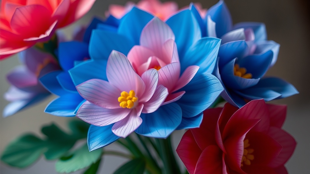
Most DIY paper flowers look like, well… paper. Flat edges, stiff shapes, and colors that scream “craft project.” That’s fine for quick decor, but if you want something that genuinely fools the eye—or at least earns a double-take—you need to approach this differently.
This guide walks through a method that prioritizes realism: shaping, layering, and subtle color work that gives your flowers depth and life. No fancy machines required—just patience and a willingness to slow down.
What You’ll Need (And What Actually Matters)
- Crepe paper (medium or heavy weight) – This is non-negotiable if you want realistic texture.
- Floral wire (18–24 gauge) – Different thicknesses help structure petals vs stems.
- Floral tape – The slightly tacky stretch is key for clean wrapping.
- Sharp scissors – Dull blades ruin edges.
- Glue (tacky or hot glue) – Use sparingly.
- Pastels or watercolor – For subtle shading.
Skip cardstock. It’s too rigid. Realism comes from flexibility and fine texture.
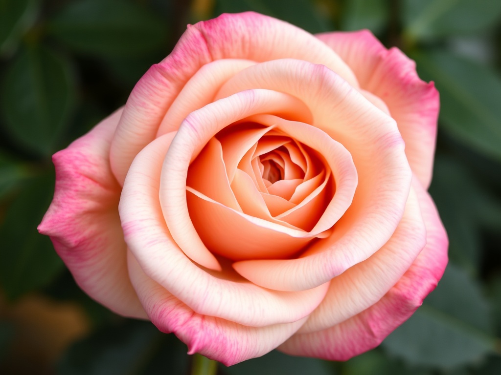
Step 1: Study a Real Flower First
Before cutting anything, spend five minutes looking at a real flower (or a high-quality photo). Notice:
- Petal shape variation (they’re rarely identical)
- Color gradients (darker near the base)
- How petals curl or fold
If you skip this, your brain defaults to symmetry—and that’s exactly what makes crafts look artificial.
Step 2: Cut Petals With Intentional Imperfection
Cut multiple petals in slightly different sizes. For a basic rose, you’ll want:
- 5 small inner petals
- 7–10 medium petals
- 10–15 larger outer petals
Don’t stack and cut identical shapes. Instead, cut freehand with subtle variation. Uneven edges are your friend here.
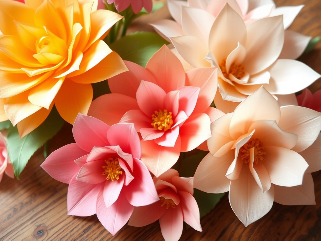
Step 3: Add Color Depth (This Changes Everything)
Flat color is the fastest way to ruin realism. Lightly brush or rub pastel near the base of each petal. Blend outward so the color fades naturally.
For example:
- Roses: deeper red or pink at the base
- Peonies: soft yellow or coral centers
- White flowers: faint green or cream near the base
Keep it subtle. If you can clearly see the transition, you’ve gone too far.
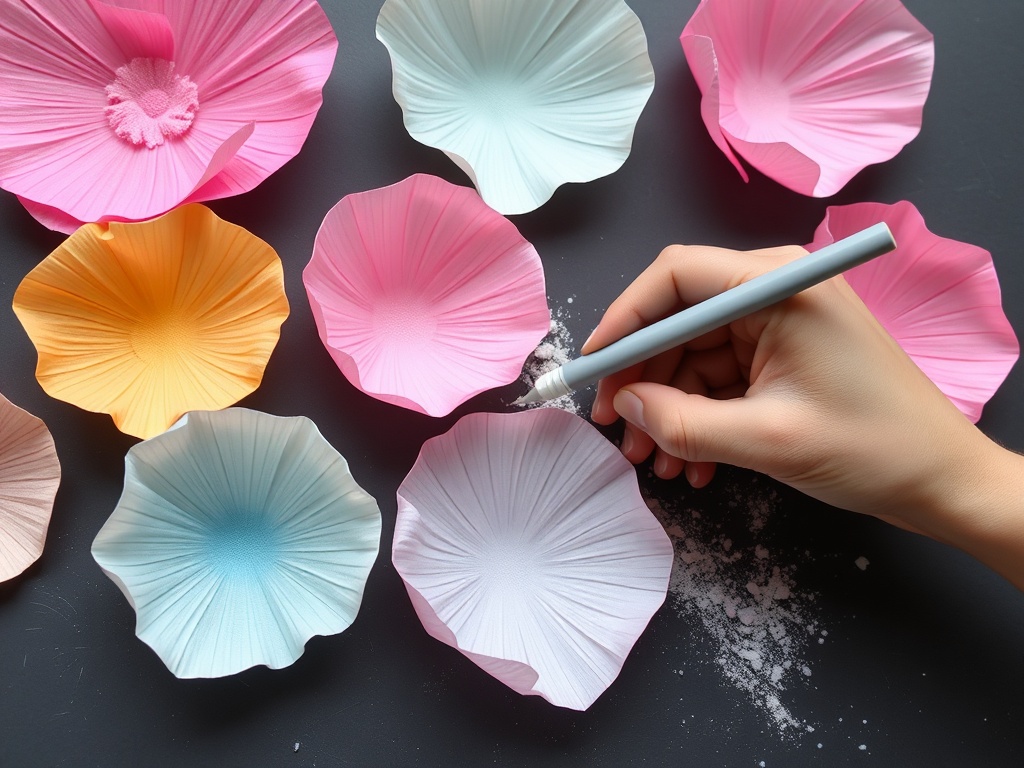
Step 4: Shape Each Petal by Hand
This is where realism really happens.
Stretch the crepe paper gently in the center of each petal to create a natural curve. Then curl the edges using a pencil, skewer, or your fingers.
Mix it up:
- Some petals should curl inward
- Others should flare outward
- A few should look slightly crumpled
Perfect symmetry kills the illusion. Controlled randomness brings it back.
Step 5: Build a Natural-Looking Center
The center sets the tone. For a rose, start by wrapping a small strip of paper tightly around floral wire. This becomes the bud.
Add your smallest petals first, wrapping them closely around the center. Don’t flare them out yet—keep them tight and slightly closed.
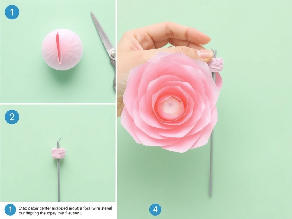
Step 6: Layer Outward With Increasing Openness
Now begin attaching medium and larger petals. As you move outward:
- Space petals slightly farther apart
- Angle them outward more
- Loosen the wrap
This gradual transition—from tight center to open outer petals—is what mimics real growth patterns.
If every layer looks equally open, the flower will feel flat.
Step 7: Secure and Wrap the Stem Cleanly
Once all petals are attached, secure the base with floral tape. Stretch the tape slightly as you wrap—it activates the adhesive.
Wrap downward in a smooth spiral. Avoid bulky overlaps. A clean stem quietly reinforces the realism.
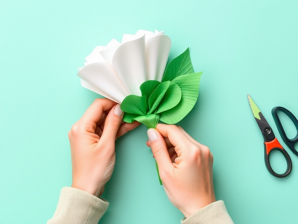
Step 8: Add Leaves (But Don’t Overdo It)
Leaves should complement, not compete. Cut simple leaf shapes, add a faint center vein with a crease, and attach sparingly.
Two or three well-placed leaves beat a cluster every time.
Step 9: Final Adjustments Make the Difference
Step back and look at the flower as a whole. Then tweak:
- Bend a few petals slightly
- Rotate the bloom angle
- Add tiny imperfections
This is where you move from “good craft” to “convincing object.”
Common Mistakes (And How to Avoid Them)
- Too symmetrical: Real flowers aren’t perfect circles.
- Over-gluing: Excess glue stiffens petals.
- Ignoring color variation: Flat tones look artificial instantly.
- Rushing shaping: This step matters more than cutting.
Why This Method Works
Most tutorials focus on steps. This one focuses on decisions—what to exaggerate, what to soften, and what to leave imperfect. Realism isn’t about copying a flower exactly. It’s about mimicking the patterns your eye expects to see.
Once you understand that, you can apply the same approach to any flower type: tulips, peonies, ranunculus—whatever you’re drawn to.
Take It Further
If you want to push this even further:
- Experiment with double-layered crepe for thicker petals
- Use diluted acrylic washes for more complex gradients
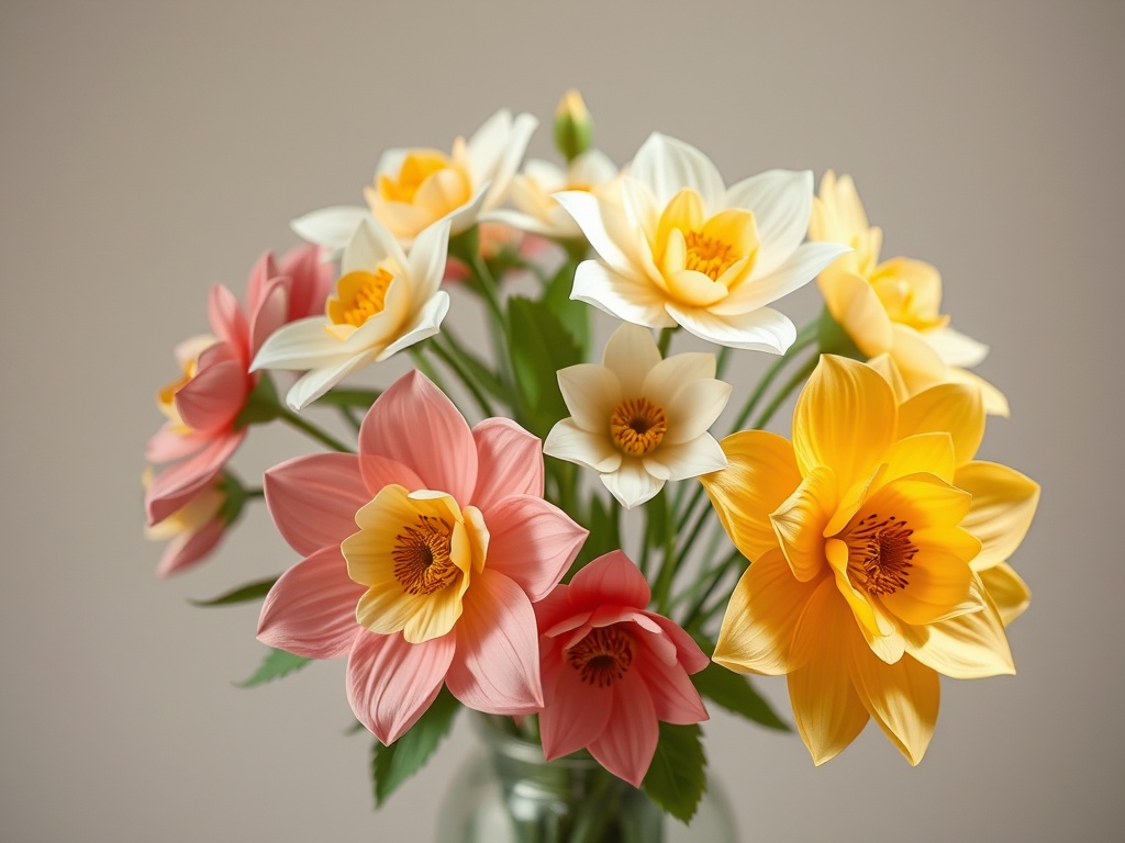
- Combine multiple blooms into a single arrangement
At that point, you’re not just crafting—you’re building something that holds up as decor, photography prop, or even a small business product.
Closing Thought
The difference between a forgettable paper flower and a striking one isn’t the materials. It’s restraint, variation, and attention to detail. Take your time, trust your eye, and don’t aim for perfection—aim for believable.